Haven Medical
Healthcare

The Story Behind the Design
Haven Medical Centre is more than just a healthcare provider — it is a sanctuary for healing, compassion, and community care. Rooted in the belief that health is holistic, the centre stands as a safe space where medical excellence meets genuine human connection. It exists to bring clarity, comfort, and confidence to every patient’s journey.
Discovering the Vision
The vision was to create a modern yet comforting identity that communicated professionalism, innovation, and warmth all at once.
Designing The Symbol
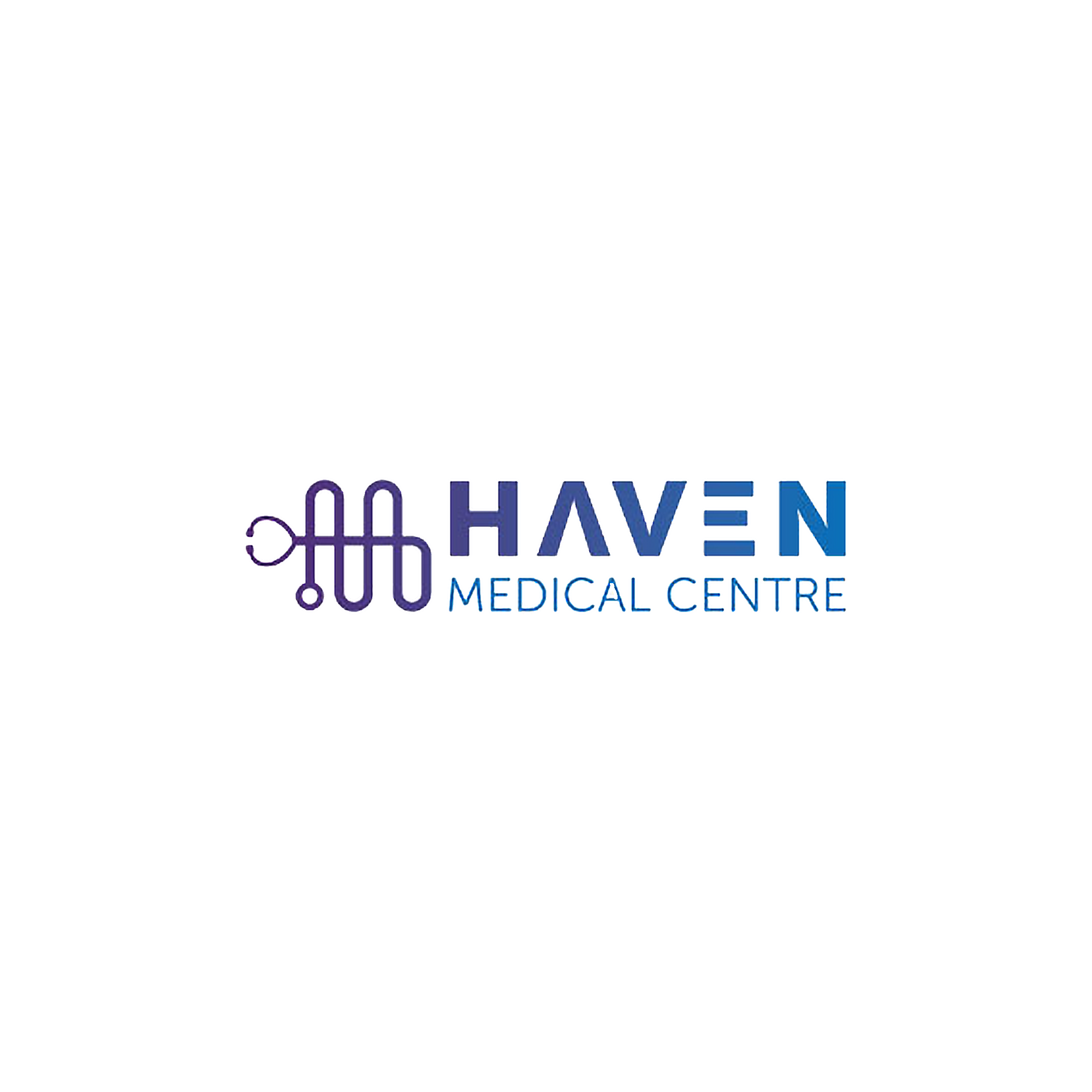
At the core of the logo is a stylized stethoscope forming a fluid, wave-like design. This shape represents the steady rhythm of care and the continuous nature of healing. The f lowing form subtly mirrors the letter “H”, tying directly to the centre’s name. It also symbolizes connection between doctor and patient, science and compassion, and body and mind.

Purple conveys empathy, dignity, and healing.
Blue evokes trust, intelligence, and calm assurance.
Together, they signal a space that is both clinically excellent and emotionally supportive.
The typography balances strong, modern lines with open spacing, reflecting both professionalism and accessibility. The word “HAVEN” features stylized cuts and spacing that bring a sense of modernity and approachability, while “MEDICAL CENTRE” grounds the identity with clarity and calm.
The Final Emblem
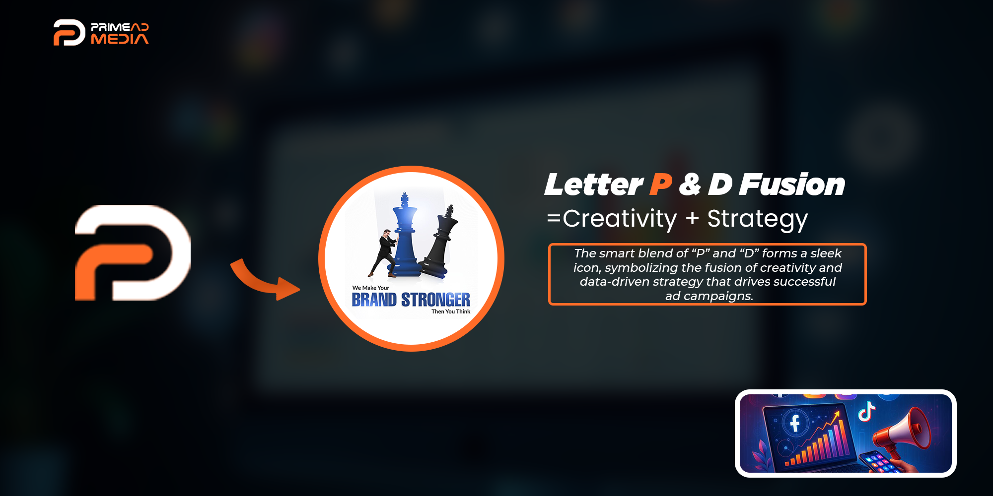
The finished identity for Primeads Media is a symbol of growth, reach, and creativity in motion.