Delta Medical Foundation
Healthcare
The Story Behind the Design
Delta’s story is grounded in its promise: “healthcare that cares beyond treatment.” The brand needed a visual identity that could represent compassion, vitality, and excellence, speaking both to the science of medicine and the humanity behind it.
Discovering the Essence
From the very beginning, we knew the design could not be cold or clinical. Hospitals and clinics often fall into sterile visuals that feel distant, but Delta Medical Clinic sought to be different—a place where people felt welcomed, nurtured, and supported.
Health as vitality
(not just absence of illness).
Medicine as service
(not just prescriptions).
The clinic as a family space
(not just a facility).
The name Delta itself also symbolizes change, transformation, and balance, echoing the brand’s role in guiding patients toward a better quality of life.
Designing The Symbol
The process was about bringing together humanity and science into one cohesive mark.

We began with the letter “D”, shaping it into something more than a letter: anembrace and a pathway to healing.
The human figure was added to embody patients, doctors, and community together, symbolizing that Delta is not just about treatment, but restoring people to life and vitality.
The color palette was carefully chosen to stand out among competitors while remaining instantly recognizable as healthcare-oriented.
The design moves beyond being a static logo; it visually conveys a story of health, protection, and renewal.
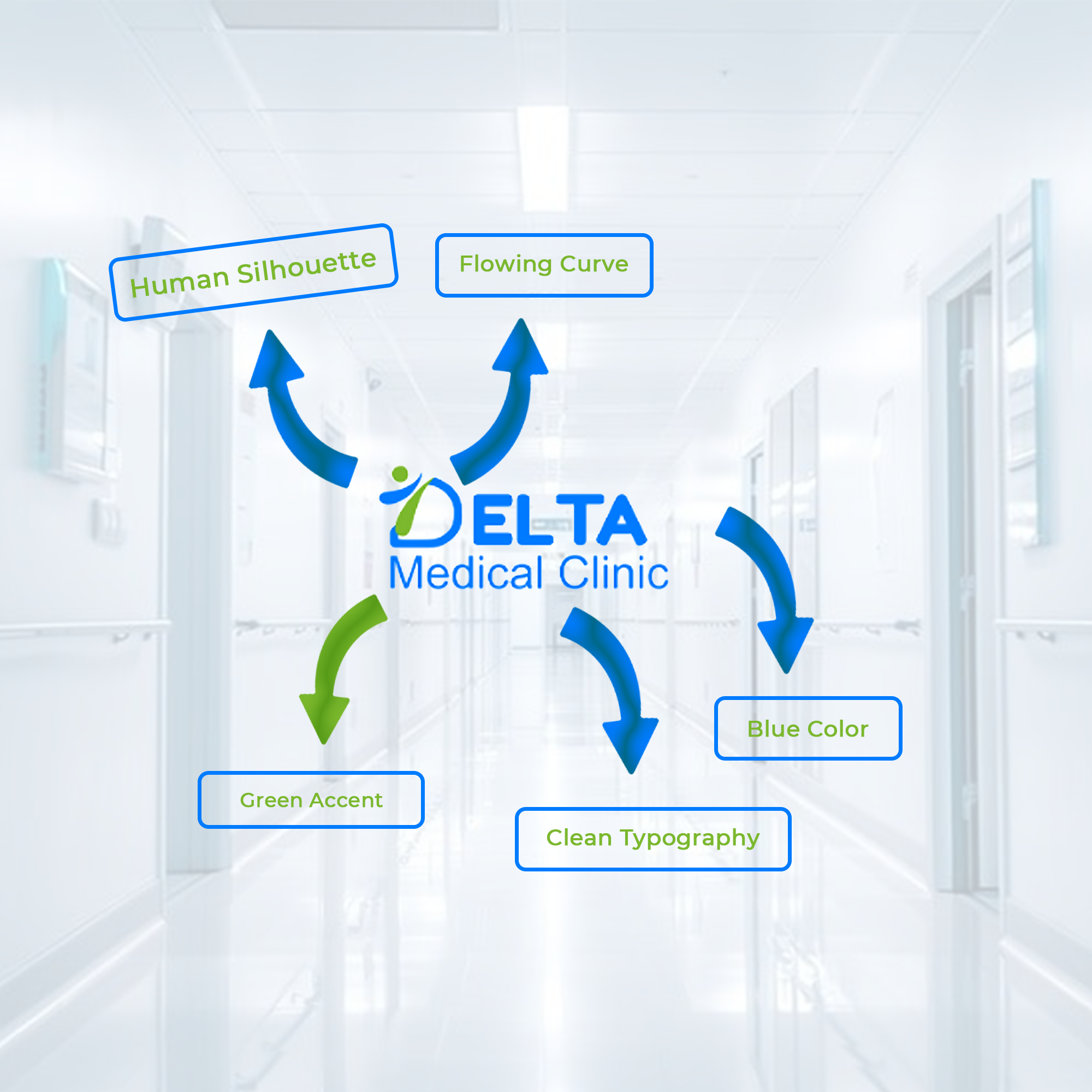
Design Symbolism
1. Human Silhouette & Motion (Green Figure)
-
- Represents a patient in motion—healthy, uplifted, and alive.
- The upward curve of the figure suggests growth, healing, and positive progress.
- Green signifies vitality, renewal, and life itself.
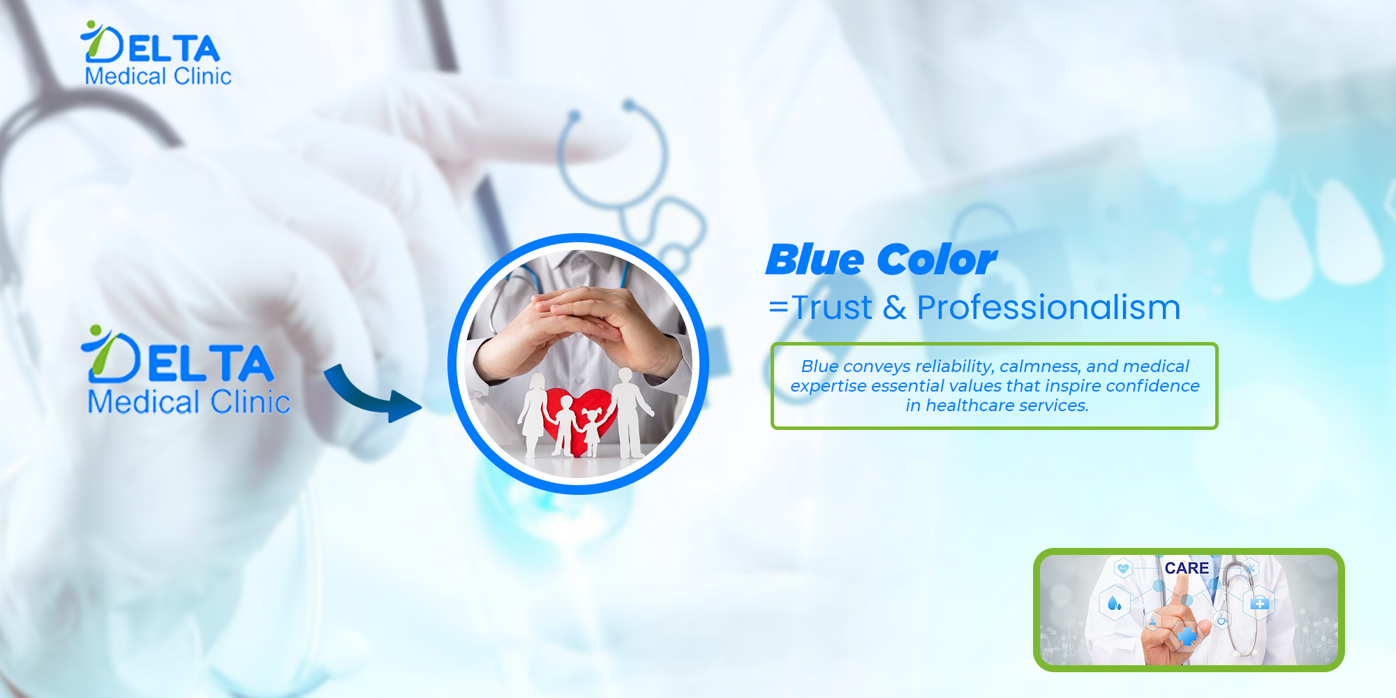
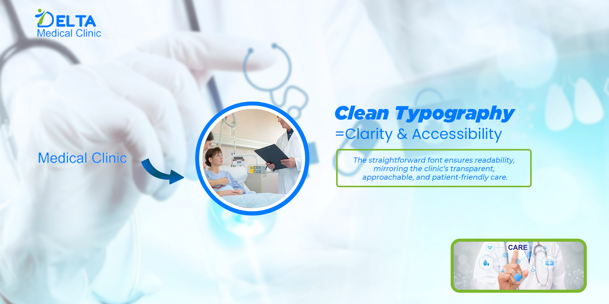
3. The Blue Typeface (“ELTA Medical Clinic”)
-
- Blue is universally linked to trust, reliability, and professionalism in the medical field..
- It reflects the calm assurance patients need in times of health challenges.
- The bold typeface reinforces stability and authority, while still remaining approachable.
2. The Curved “D” Shape
-
- Doubles as both the initial of Delta and a symbolic embrace, showing care and
inclusivity. - Suggests a shield of protection and safety, echoing trust in healthcare services.
- Doubles as both the initial of Delta and a symbolic embrace, showing care and
4. Dual-Color Harmony (Blue & Green)
-
- The blend of blue and green symbolizes the balance between science and care.
- Blue = the knowledge, expertise, and professionalism of medicine.
- Green = the human, natural, and healing side of care.
The Final Emblem
It represents the clinic as a beacon of health and wellness, embodying both medical excellence and genuine compassion. For patients, this logo becomes more than a brand mark—it’s a reassuring promise: “You are safe here, and we will walk with you on your journey to wellness.”