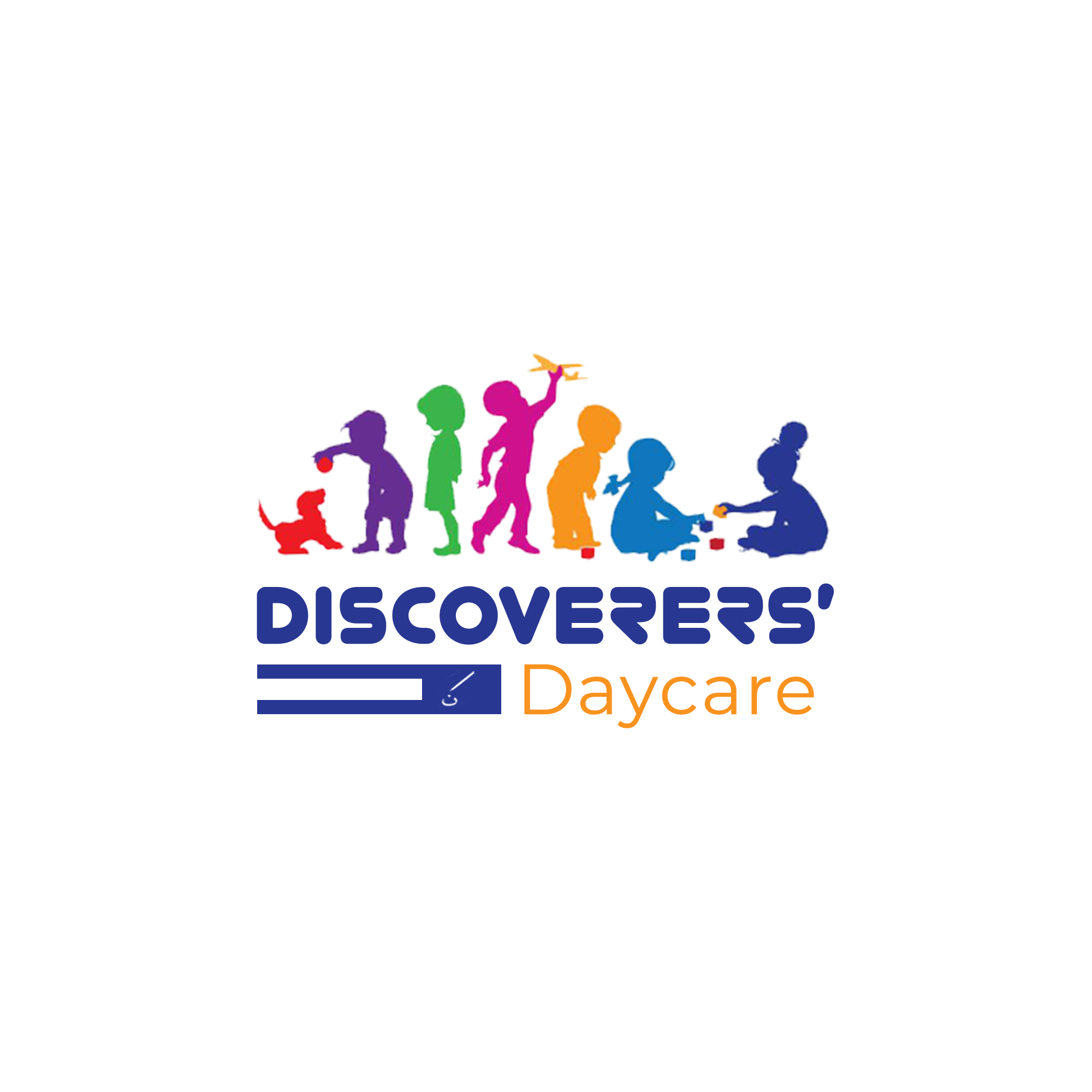
Discoverer’s Daycare
Education
The Story Behind the Design
Every child is a world waiting to be discovered. Discovere’s Daycare was envisioned as more than a place for children to stay—it’s a nurturing environment where young minds are guided, protected, and inspired to grow. The brand’s visual identity had to capture care, playfulness, learning, and safety all in one This wasn’t about creating a generic daycare logo—it was about telling a story of early discovery, where curiosity is celebrated and each child’s uniqueness is honored.
Discovering the Essence
From our earliest design explorations, it became clear that Discovere’s Daycare needed to feel warm, vibrant, and welcoming. Parents had to see trust and safety, while children had to see fun and play. The essence captured was:

Play as learning
Children discover through games, exploration, and creativity.
Safety as growth
Nurturing children in a secure, trusted space.
Community as family –
The daycare acts as an extended hand of the parents.
This identity had to feel alive, colorful, and full of joy, just like childhood itself.
Designing The Symbol
The process began by asking: “What does discovery look like for a child?”
The vibrant palette was chosen first to break away from seriousness and reflect joyful energy.
Playful, human-like forms were introduced to show children actively engaging, symbolizing curiosity and fun.
Typography was softened to reassure parents and reflect the nurturing environment.
The design took shape as a playful emblem of growth, striking the balance between a child’s world of fun and a parent’s need for trust.
Design Symbolism
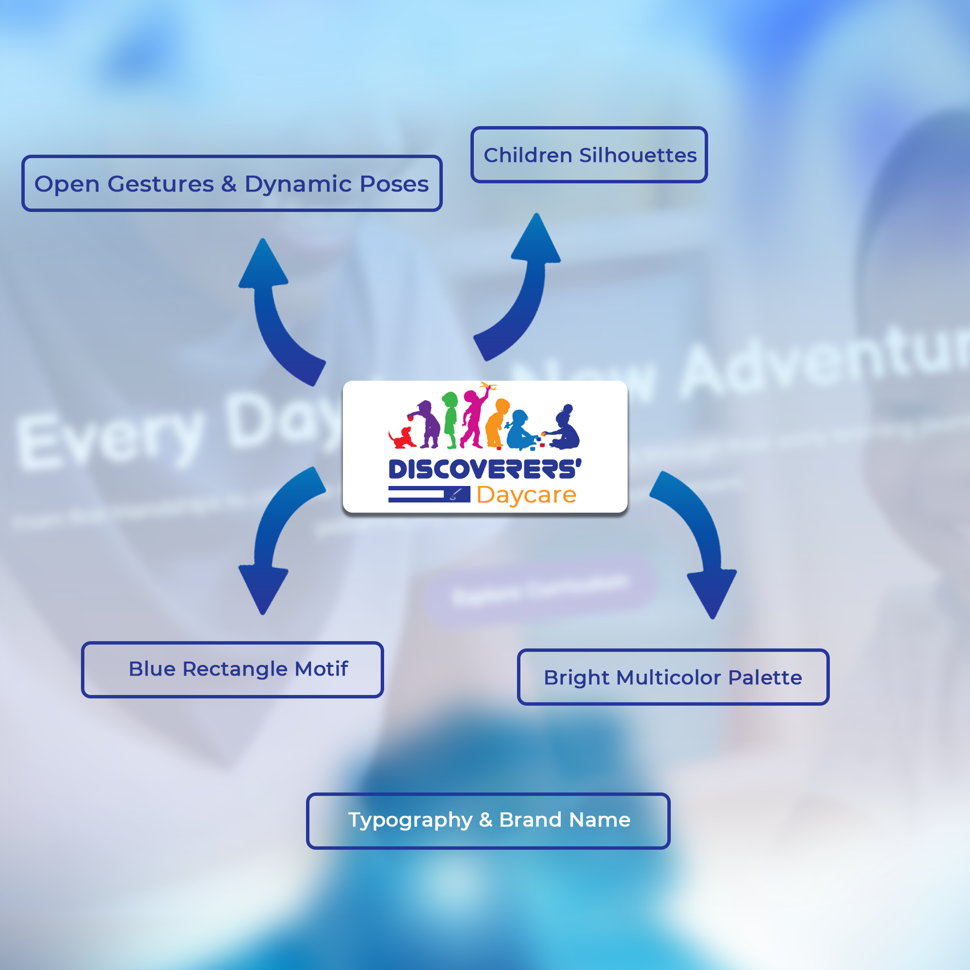
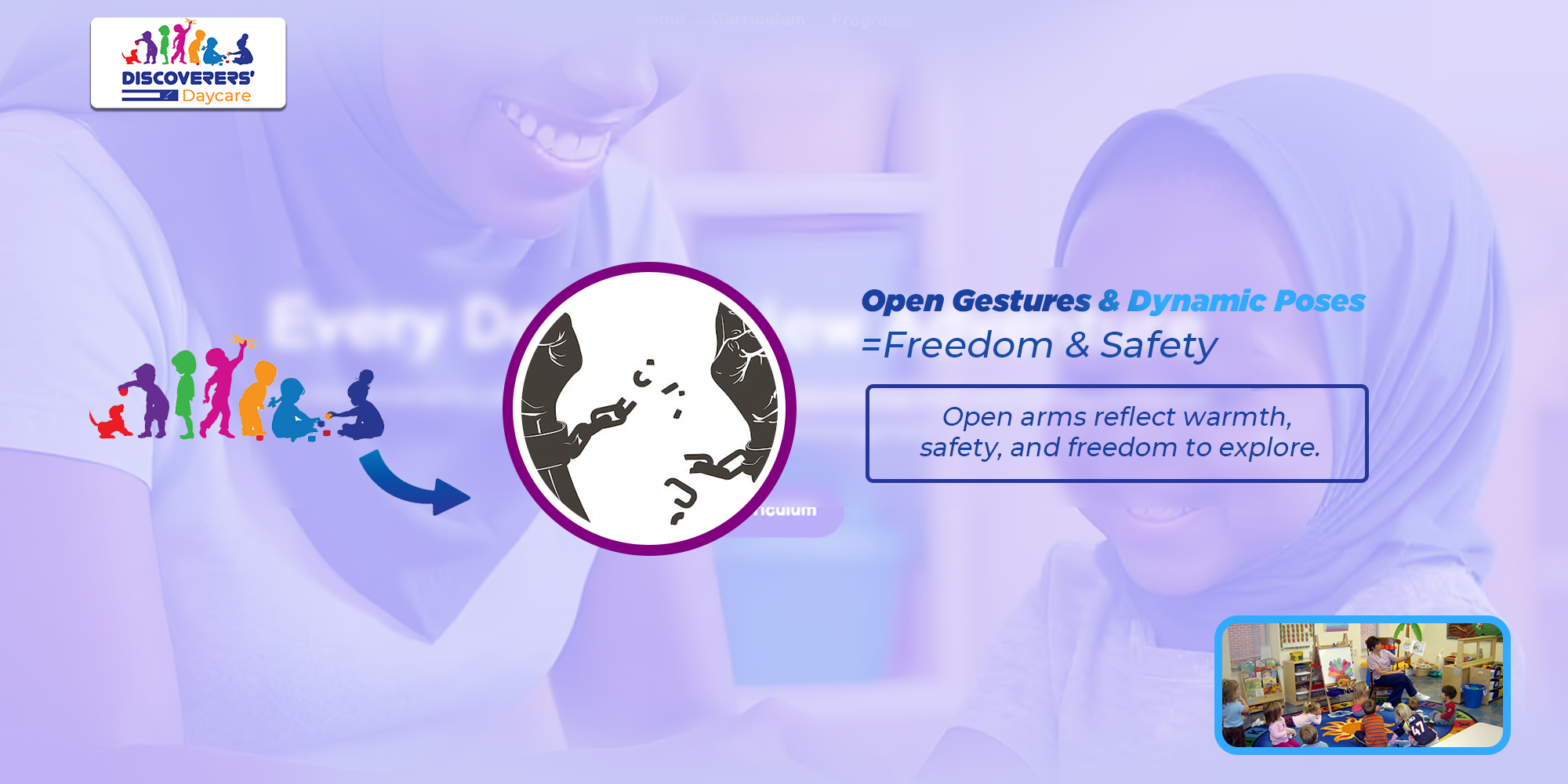
1. The Child-like Figures / Shapes
-
- Represent children at the heart of the brand.
- Their open, dynamic forms suggest energy, curiosity, and play.
- They also reflect inclusivity and diversity, welcoming every child.
3. The Rounded Letterforms
-
- The soft, rounded typography communicates gentleness and friendliness.
- This ensures the brand feels safe, approachable, and child-centered.
2. Bright & Vibrant Colors
-
- Multiple colors mirror the playfulness and vibrancy of childhood.
- Each color represents a unique trait:
○ Yellow → Happiness, sunshine, and optimism.
○ Red → Energy, excitement, and creativity.
○ Blue → Calm, trust, and reliability (the foundation of safety).
○ Green → Growth, learning, and harmony.
4. Motion & Discovery
-
- The logo elements suggest movement and exploration, aligning with the daycare’s philosophy that discovery is an active process of growth.

The Final Emblem
The final logo for Discovere’s Daycare is a celebration of childhood discovery and safe
growth. It stands not just as a brand mark, but as a living promise to both parents and children:
“Here, every child is safe, loved, and free to discover their world.”