Prime Ads
Prime Ads
The Story Behind the Design
In today’s crowded digital space, brands don’t just need visibility — they need impactful presence. Primeads Media was born to give businesses that edge, specializing in strategic ad placements and digital promotions that help brands stand tall in competitive markets. When designing their identity, our goal was clear: create a modern, bold, and authoritative emblem that instantly communicates growth, visibility, and innovation in advertising.
Discovering the Essence
During brand discovery, we uncovered three pillars at the heart of Primeads Media:
Promotion with Purpose
Ads that don’t just run, but deliver results.
Visibility & Reach
Helping brands rise above the noise with precision targeting
Innovation in Strategy
Creative, data-driven solutions that adapt to the digital age.
The brand identity had to capture this balance of professional credibility and forward-thinking creativity
Designing The Symbol
The process began with one guiding idea: “How do we visually represent advertising as both creative and results-driven?”
The arrow-inspired motif was developed to reflect direction, targeting, and impact.
The color combination of orange and black was carefully chosen to blend vibrant creativity with professional trustworthiness.
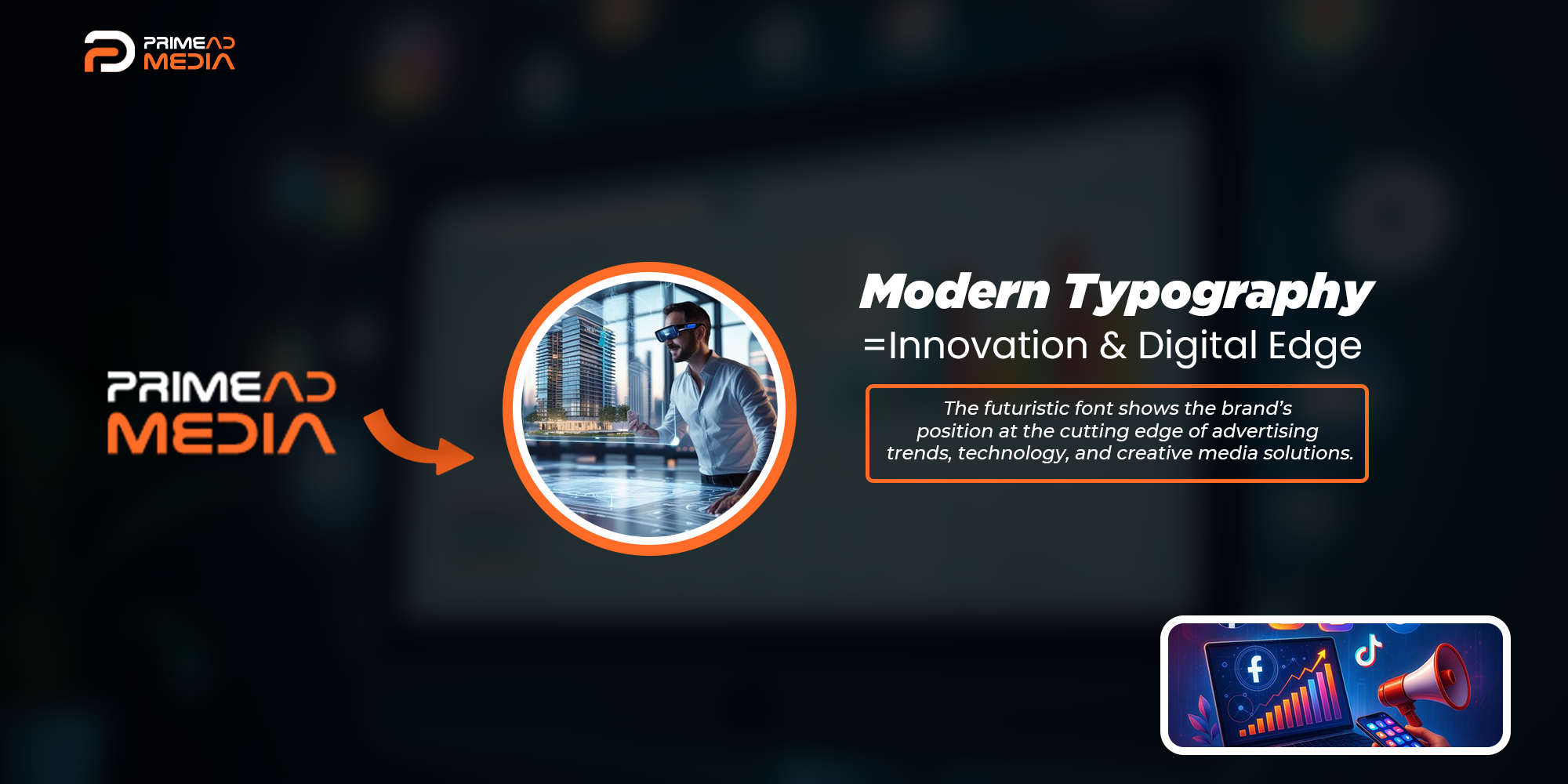
Typography was designed to feel strong and direct, much like effective advertising.
The result was a visual language that’s bold, digital, and scalable.
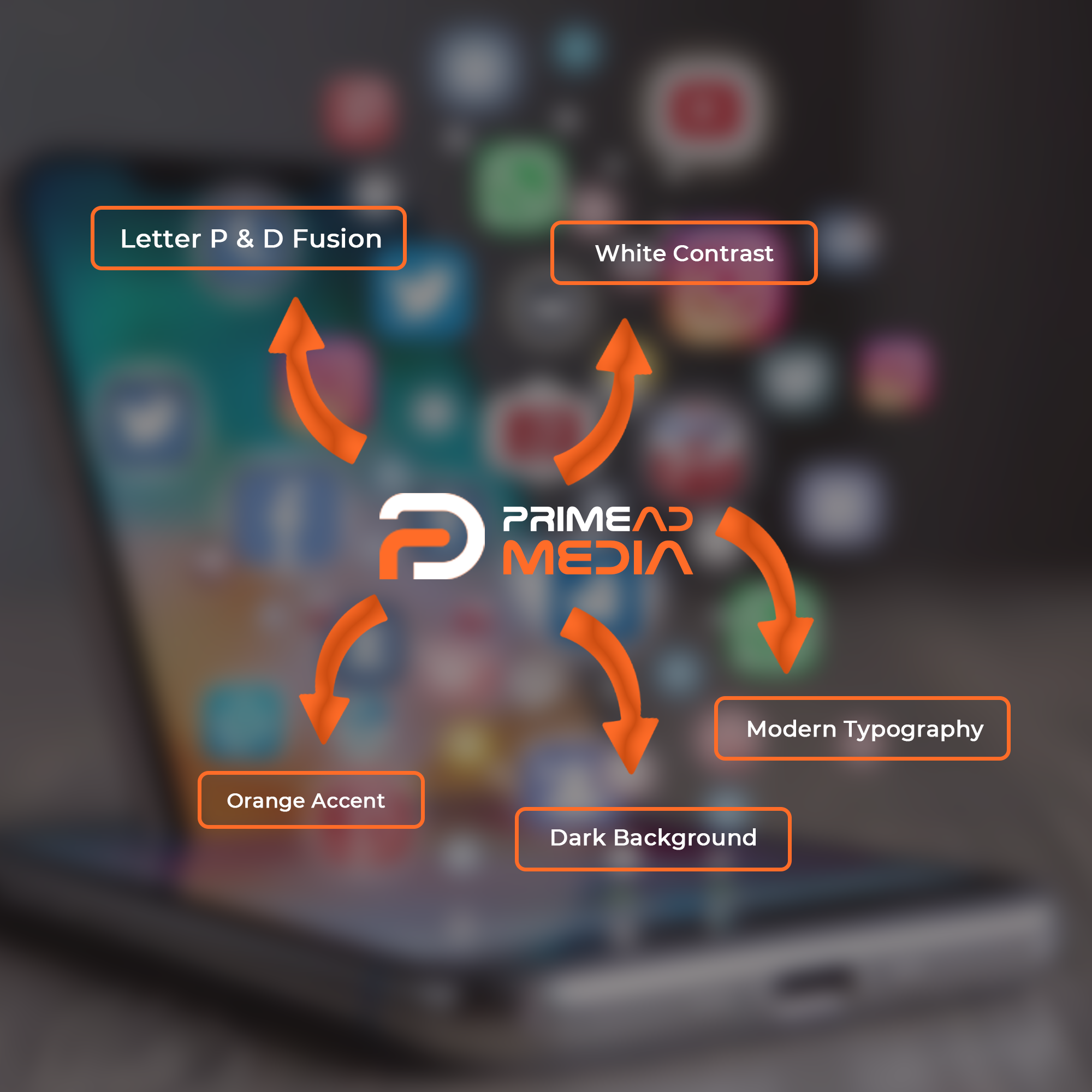
Design Symbolism
1. Bold Typeface
-
- The solid, modern typography projects confidence, professionalism, and authority.
- The clean structure reflects the clarity and precision needed in advertising.
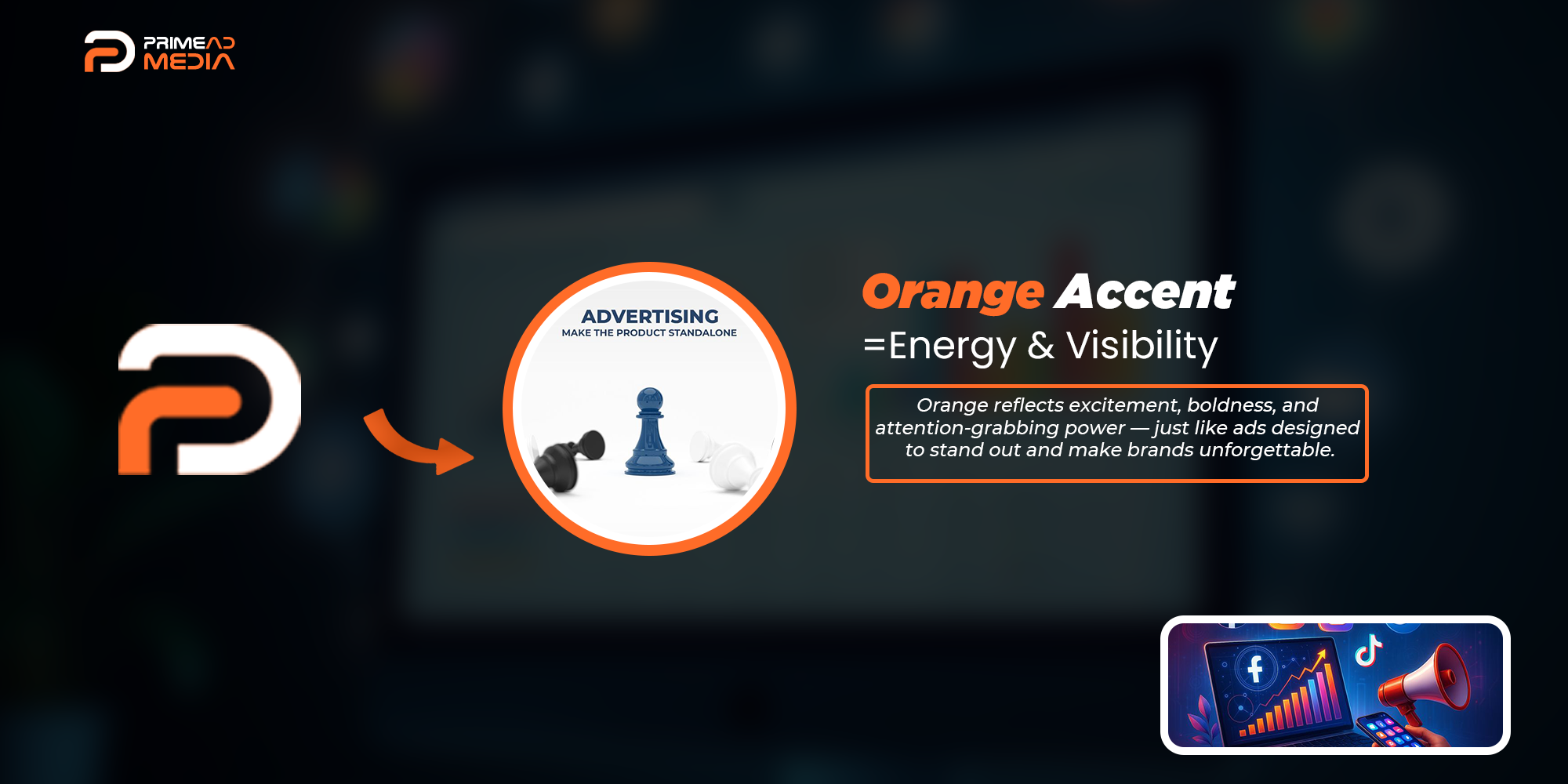
3. Orange & Black Palette
-
- Orange stands for creativity, enthusiasm, and attention-grabbing energy — the core of impactful advertising.
- Black conveys authority, professionalism, and strategic depth.
- Together, they form a balance of creative spark and trusted expertise.
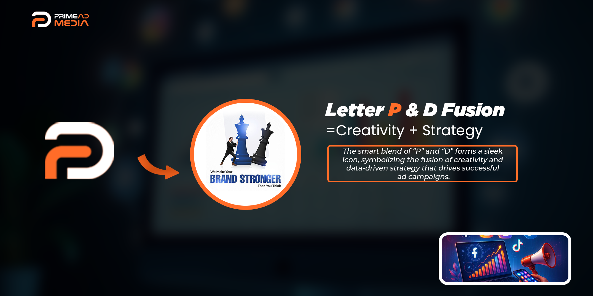
2. Dynamic Arrow-Inspired Mark
-
- The angular symbol suggests movement, progress, and upward growth.
- Represents the trajectory of ads leading to higher visibility and results.
4. Minimalist Structure
-
- The geometric precision ensures the logo feels modern, adaptable, and digital-first.
- Works seamlessly across platforms from social media ads to corporate presentations.

The Final Emblem
The finished identity for Primeads Media is a symbol of growth, reach, and creativity in motion.
You might also like