Season & Sustenance
Wellness

The Story Behind the Design: Seasons and Sustenance
Every great brand begins with a heartbeat. For Seasons and Sustenance, that heartbeat was
the promise of living in harmony with life’s natural rhythms nourishing the body,
uplifting the spirit, and embracing each season of change.
Discovering the Essence
From our very first conversation, we knew this identity needed to breathe life, not just
look beautiful. We explored the essence of the brand its commitment to sustainability,
spiritual grounding, and personal growth then began translating those values into a visual
language.

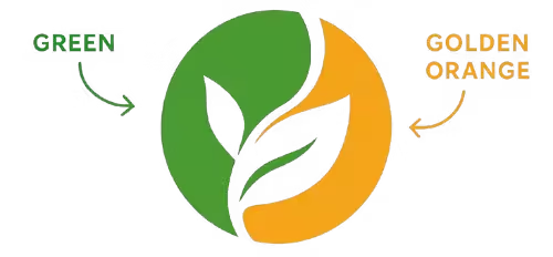
Green Half
Represents vitality, health, nourishment, and spiritual growth. Green connects to the idea of renewal and sustenance for the body and soul.
Dual-Colored Leaf Motif
The logo features a split leaf design, with one half in green and the other in golden orange. This signifies the balance between life’s natural cycles, growth, transformation, and sustainability.
Golden Orange Half
Symbolizes warmth, change, and the transitions of
seasons, echoing the brand’s focus on midlife transitions and spiritual
enlightenment.
Circular Background:
The logo’s slightly curved golden-orange backdrop
mirrors the sun’s cycle, a metaphor for the passage of time and life’s
enduring transformations.
Designing the Symbol
The circle became our canvas, symbolizing the unending cycle of life. Each quadrant tells its
own story:
The Green Leaf
Growth, and the nourishment we give to ourselves and the planet.
The Yellow Flame
Energy, enlightenment, and the warm light of transformation.
The Blue Wave
Life’s flow, adaptability, and the nurturing embrace of water.
The Light blue Air
Clarity, calmness, and the quiet strength of mindfulness.
The Final Emblem
The final design isn’t just a logo; it’s a living emblem. It tells the story of growth through
every season, sustenance in every form, and the inner peace that comes from embracing
the journey.
