A1 Medical
Healthcare
The Story Behind the Design:
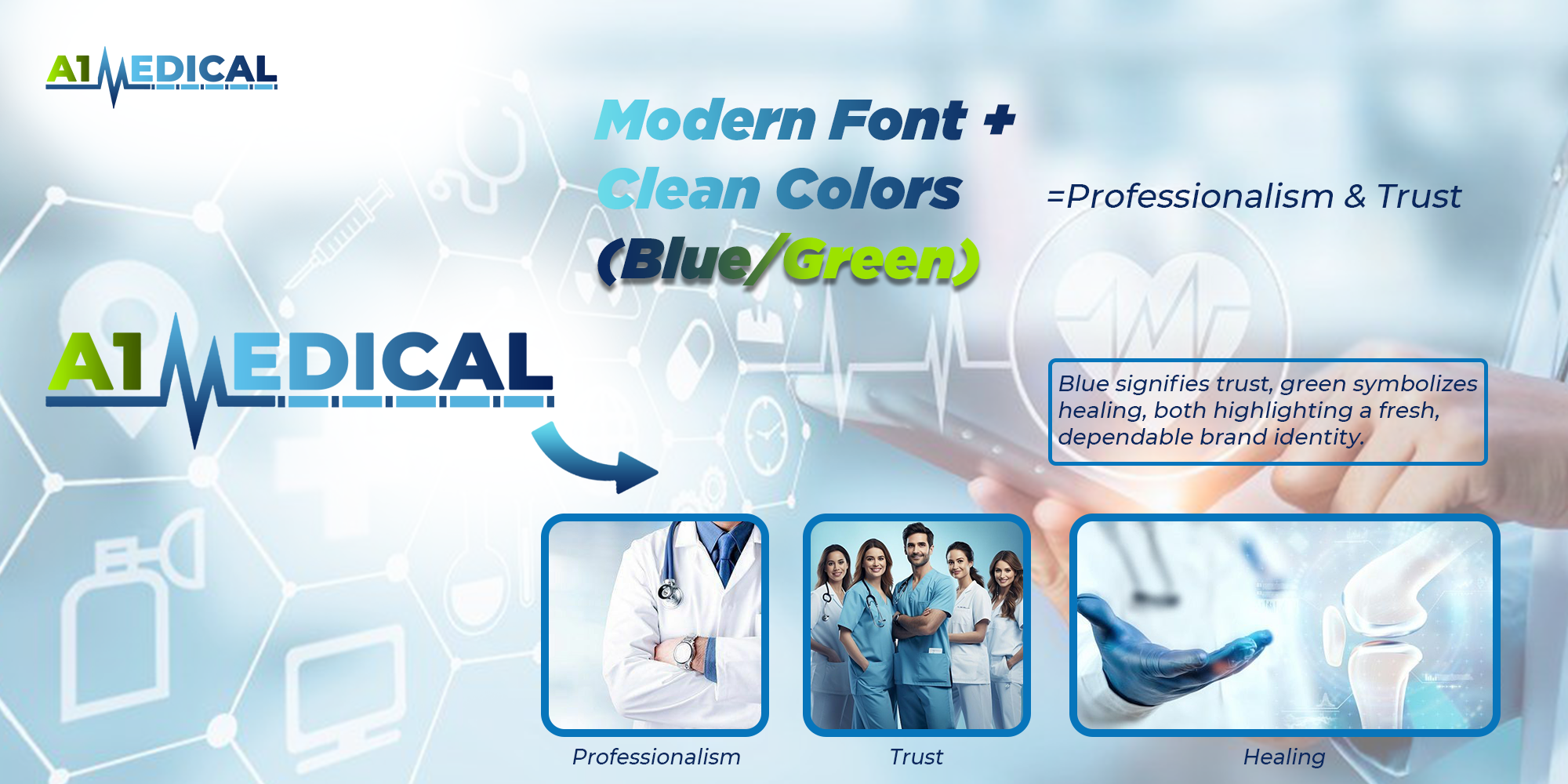
Healthcare brands must inspire trust, care, and reliability. For A1 Medical, the vision was to create a brand identity that reflects professional excellence and compassionate service. The name “A1” itself signifies top quality, first-class standards, and dependable care. Our design approach had to capture both the scientific precision of medicine and the human warmth of healing.
The brand was not only about offering healthcare services, but about building a symbol of hope, wellness, and professionalism. Every element of the design needed to reassure patients that they are in safe, capable hands.
Discovering the Essence
Our discovery sessions revealed three defining pillars for A1 Medical’s identity:
Excellence in Care
The brand should immediately convey quality and
trustworthiness.
Compassionate Healing
Patients should feel welcomed and cared for, not just treated.
Professionalism & Modernity
The brand must balance warmth with modern healthcare innovation.
Design Symbolism
The circle became our canvas, symbolizing the unending cycle of life. Each quadrant tells its
own story:

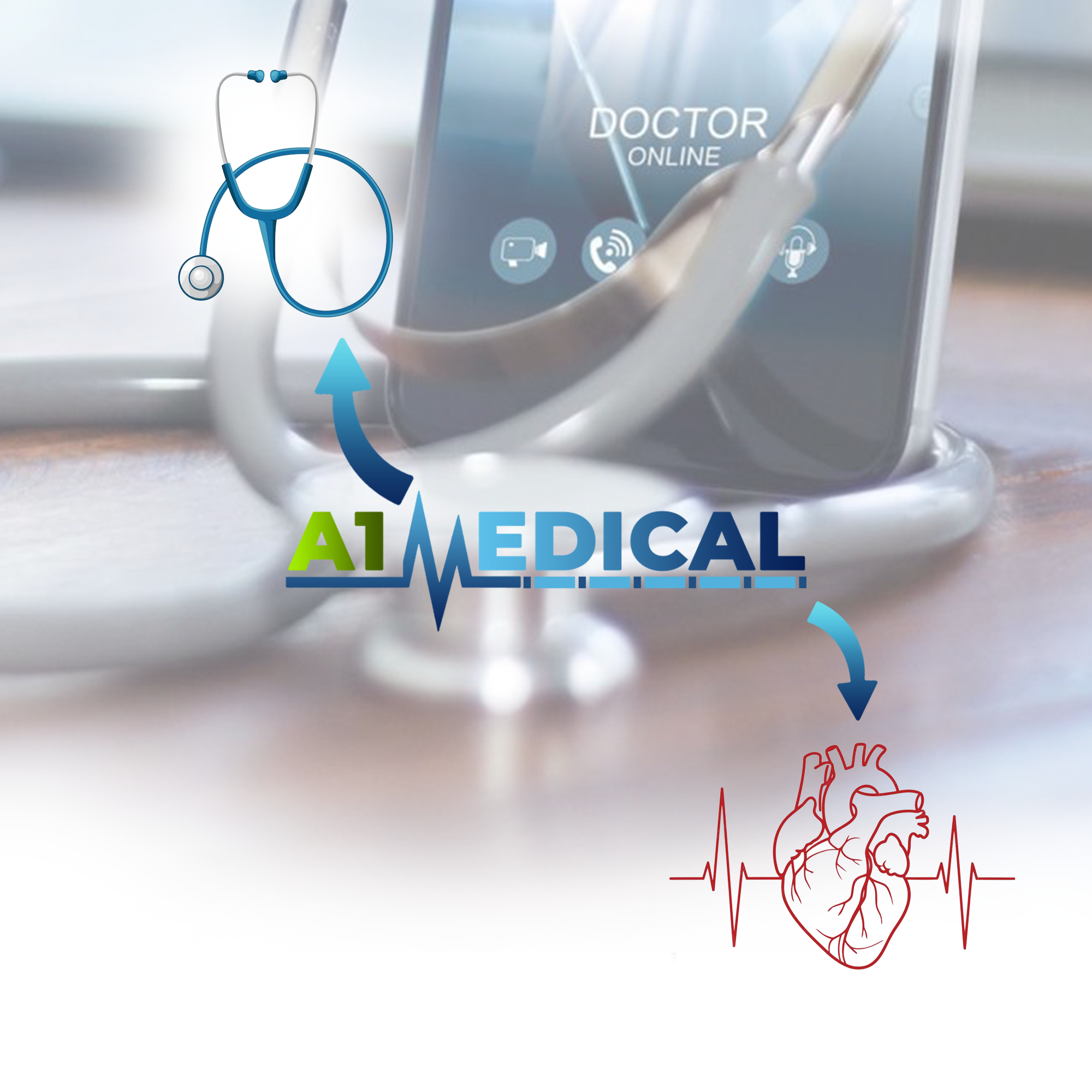
The Stethoscope
- Represents healthcare, diagnosis, and medical professionalism.
- Doubles as a symbol of listening and care, since healthcare begins with understanding patients.
Cross Symbol
- Universally recognized for medicine, healing, and emergency care.
- Placed within the logo to instantly communicate trust, safety, and wellness.
Circular Embrace
- Encircling shapes represent unity, protection, and wholeness.
- Suggests the idea of being cared for from every angle, holistic healing.
Typography
- Clean, modern, and bold fonts emphasize professionalism and authority.
- Readable and adaptable across digital and print mediums.
Designing the Symbol
We wanted the logo to look professional yet approachable. The stethoscope element was blended seamlessly with the medical cross to create a dual representation:
-
- A modern medical symbol for quick recognition.
- A human touch that shows the brand cares beyond just treatment.
Circular framing around the emblem was introduced to give a sense of continuity and
holistic care, making the identity complete and balanced.

The Final Emblem
The final design for A1 Medical tells a story of trust, healing, and professionalism:This emblem is more than just a healthcare logo; it is a promise of excellence. It communicates that with A1 Medical, patients receive nothing less than top-quality, first-class care — always.