Listen to this Blog Post
Do you want to know why your website’s bounce rate is high?
I mean why a lot of your traffic do not stay on your website long enough to consume your content and make a decision?
I have in this blog post examine those hidden reasons you might not be aware of, or those ones who look so insignificant to you that you may not take cognizance of.
Now… if you read this post to the end and make those necessary changes, you will be surprised to see how much conversion you will be getting from your website.
Introduction
You’ve designed a great website with all the best details in mind. You have edited the content three times over and think the page truly stands up against those you aspire to be like — so, why aren’t your visitors sticking around?
Are you getting traffic to your website, but very few of those visitors are converting? Read on to learn where the holes of your website may be and what you can do to repair them to keep your users engaged.
A good website boosts your reputation while a bad one will scare away potential customers. This should be motivation enough to invest in a good website.
we will take an in-depth look into the reasons why people leave your website:
- Your design is outdated.
- Your content is hard to read.
- Your website relies on outdated plugins.
- You’re overwhelming people with advertisements.
- The videos on your website auto-play.
- Your registration requirements are obtrusive.
- Your site is slow to load.
- Your product’s benefits aren’t clear.
- You never provide a call-to-action.
- Your content or products do not live up to your landing page’s promises.
- Your website isn’t responsive.
- And more!
(1) Your design is outdated.
It’s an unfortunate truth, but we all judge books by their covers. On his blog “Social Triggers,” Derek Halpern shared a fascinating research that supports the impact a website design can have on its perceived trustworthiness.
In the study, psychologist and researcher Dr. Elizabeth Sillence asked participants to review websites on the topic of high blood pressure and then rate whether they trusted or distrusted the site.
In a surprising turn of events, the study found that 94% of wary participants attributed their uneasiness to the website design.
Design matters. One reason why people leave your website is if your website design still appears like something out of 1996 Geocities, it’s time for a professional face-lift. That is one reason why people leave your website
(2) Your content is hard to read.
On a similar note, consider that website design isn’t just about colors, images and graphics.
The font styles you use, as well as the colors of your text and background, can determine how easily people can read and digest the content on your website.
If it can’t be easily read, it’s just not going to convert effectively.
There are no unalterable guidelines about which fonts to use and which to avoid– except you must never, ever use Comic Sans.
Instead, stick to high-contrast color combinations and clean, ornamentation-free serif or sans serif fonts for finest results. Here are a couple of ideas and concepts on picking the ideal fonts for your marketing.
When it comes to font size, stick to larger font styles to provide visitors a better experience whether they’re on desktop or utilizing a mobile device.
For headings, utilize a font style size of 22 px or larger. For body copy, adhere to 14 px or larger.
(3) Your website relies on outdated plugins.
If you’ve got your site’s sales content buried in Flash files, you’re going to be left waiting a long time for users who have neither the time nor the inclination to set up upgraded versions of this outdated plugin.
Even YouTube has dropped the Flash object embeds in favor of the more contemporary HTML5 video player.
Rather, use HTML5 for all of your videos and animations. To provide a better experience for users who can’t or do not want to watch a video (and to help increase SEO), include a summary, notes, or a transcript of the video.
Remember, though, that plugins and add-ons are deprecated all the time. The less bells and whistles your website adds, the less time you’ll have to spend jumping on new technology trends.
(4) You’re overwhelming people with advertisements.
If your website is operated on an ad-driven model, then removing them from your site completely might not be an option. But just because you need to have ads doesn’t mean you need to have them all over.
“Nielsen’s 2014 Trust in Advertising report” showed that survey participants trust nearly all types of traditional advertising– including newspaper advertisements, magazine advertisements, billboards, radio advertisements and infomercials– more than they trust online banner advertisements.
Because trust is a crucial element to driving conversions, restrict the number of ads you use and the places where they’re displayed.
Ads shouldn’t be the very first thing visitors see, and they should not use up more of your website’s real estate than its actual content.
(5) The videos on your website auto-play.
I don’t know about you, however nothing makes me click a website’s “Back” button faster than a video that auto-plays. Today’s digital-savvy clients prefer to choose how and when they consume online content.
Blasting at them without their permission is a quick way to drive potential customers away from your website– without a purchase.
(6) Your navigation structure is uncertain.
Raise your hand if this has ever happened to you: You open on a site looking for a particular piece of info, only to get caught in a seemingly endless maze of badly laid-out navigation options.
Unclear navigation is not just bad for your on-site user experience, it’s bad for your SEO as well.
The golden rule of navigation is this: Think through your site’s setup as if you were your own customer.
If you were completely new to your website, how would you expect to find the info arranged? What steps would you take to find the information that’ll address your questions?
Rearrange your navigation to take your user’s needs into account and you’ll stop losing potential sales due to bad content organization.
If you aren’t confident that you can reorganize your content according to consumer expectations, use a service like User-Testing to uncover potential problem areas.
(7) Your registration requirements are obtrusive.
Gated content is great for driving leads into a site sales funnel. But gating everything and protecting it with restrictive registration requirements will eliminate your conversion rate.
As you develop registration opportunities, ask yourself if every field you include is needed. If you discover it tough to cut anything, keep in mind that Expedia made an additional $12 million by getting rid of one single data field.
(8) Your site does not have personality.
Brand personality matters on your site and in your marketing campaigns.
The Millward Brown agency discovered that “there is a relationship between the method brands express themselves in various countries and the strength of the consumer relationships they produce.”
While the personality traits that are considered “ideal” differ from country to country, just having an established personality is a crucial part of a business’s success.
If your site reads like anyone could have written it, you’re going to have an issue connecting with potential clients. Your sales will suffer without that connection.
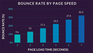
(9) Your site is slow to load.
Study from KISSmetrics reports that load times matter when it pertains to site performance. Here are some essential stats from their analysis:.
47% of consumers expect a web page to load in two seconds or less.
40% abandon a website that takes more than three seconds to load.
Even a one-second delay (or three seconds of waiting) decreases consumer satisfaction by about 16%.
(10) Your gated Offers aren’t pertinent or appealing.
Crafting a compelling offer is something, but is it pertinent to your audience? If so, are you showing it off in a manner that’s appealing to visitors?
If you see traffic patterns that show visitors are getting to your landing pages and bouncing, there’s a good chance they aren’t connecting with the offer you’re pitching.
High-converting landing pages consist of a strong call-to-action that makes it clear to the visitor what the next step is– and what to expect by taking that step.
You might also think about split testing your landing pages to see what resonates with your specific audience.
(11) Your product’s benefits aren’t clear.
If you aren’t sharing your product’s features with your clients clearly on your site, then you certainly won’t compel them to move down the sales funnel.
This is what’s referred to as selling benefits, instead of features. It’s a critically important concept to understand (and implement) as you attempt to diagnose conversion issues on your site.
(12) You never provide a call-to-action.
While this might appear like a no-brainer, research by Small company Trends suggests that 80% of little B2B business sites did not have a call-to-action as recently as 2013. Crazy, right?
They weren’t losing on sales due to the fact that their calls-to-action were inadequately written. They missed out due to the fact that they just failed to ask for the sale.
Your customers will not take action if you don’t trigger them to, so end every sales page, article, product page, and so on with a compelling and pertinent call-to-action that’ll encourage visitors to take action.
(13) Your content or products do not live up to your landing page’s promises.
In a post on the Crazy Egg blog, Cody Ray Miller writes about his experience visiting the site www.nissan.com.
You might believe that link would take you to the Nissan Motors site, right? However instead, it takes you to a computer parts site run by a family with the last name Nissan.
If you were looking for info about automobiles and arrived at that website, would you stick around?
Of course not. And yet, that’s exactly what happens when you over-promise on your landing pages.
Audiences get all hyped up, believing they’ve discovered the best solution to their needs.
When they show up on your website and discover that the information there isn’t what they were expecting, their first click will most likely be the “Back” button.
Do not over-promise and under-deliver or you’ll see low conversion rates and get a track record for baiting-and-switching your visitors.
(14) Your website isn’t responsive.
Google’s major mobile algorithm update is here, so if your website isn’t responsive to mobile phones, you’ll likely lose out significantly in the organic search rankings.
That’s not all, though: According to a study collected by Mobify, “30% of mobile buyers abandon a transaction if the experience is not optimized for mobile.”.
Transitioning to a responsive design can be a pain in the butt, however can you really afford to lose out on all that traffic and all those sales?
(15) You’re not using exit intent technology.
Remember all those visitors hitting the “Back” button I discussed earlier? There’s hope for regaining their attention using exit intent technology programs.
These are tools that track visitor mouse movement. If it appears the visitor is about to bounce, that visitor will be presented with a message or offer in a last-ditch effort to help them remain on the page.
In one example, a business using this software application to present a 10% off coupon to exiting visitors improved its overall conversion rate by 13%, leading to 2,423 conversions that would have otherwise been lost that month.
That’s pretty powerful. Companies like Picreel offer exit intent technology that’ll help you capture visitors before they leave your website.
(16) Your website’s been hacked.
The idea of your website being hacked without you even knowing may sound insane.
However according to Forbes contributor James Lyne, an approximated 30,000 websites are compromised every day.
Often times, these hacks are advanced enough that the indications go undetected by all but the most observant of web designers.
If you don’t have the time to pore over your code every day, think about a monitoring program like Sucuri to preserve that very important user trust that’s needed for website sales and conversions.
By addressing these problems on your website, you should see significant gains in your website’s performance. However these aren’t the only factors that can affect your ability to convert visitors into clients.
If you have another tip on an issue you found out was causing visitors to leave your site without purchasing, leave a note explaining both the difficulty you dealt with and how you resolved it in the comments section listed below.